This is the students’ version of the page. Log in above for the teachers’ version.
A starting point: pie charts and fractions
Part 1 – Reading and interpreting pie charts


Teacher resources for Part 1
Links to past exam questions
Teachers: log in to access these.
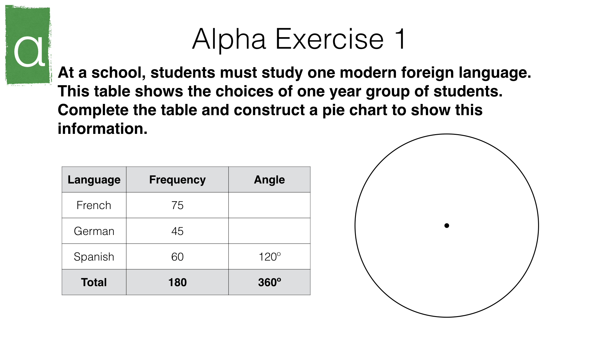
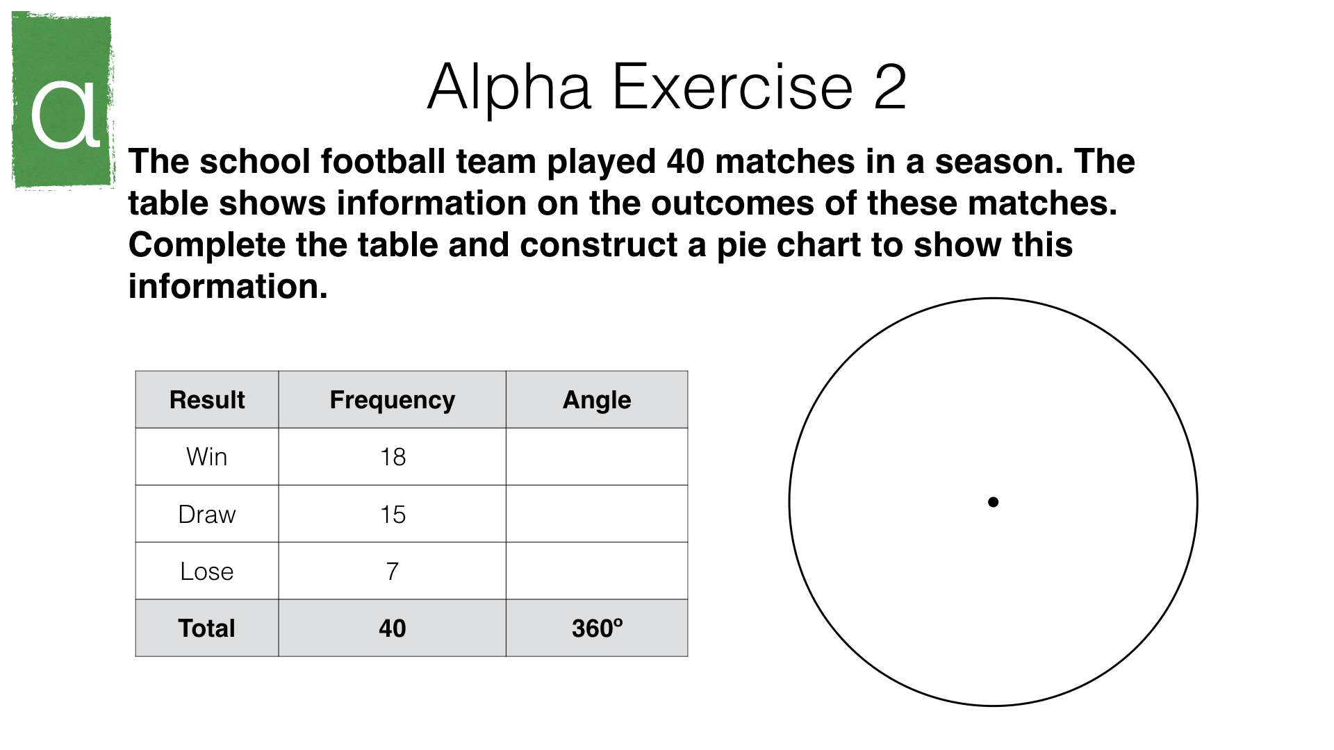
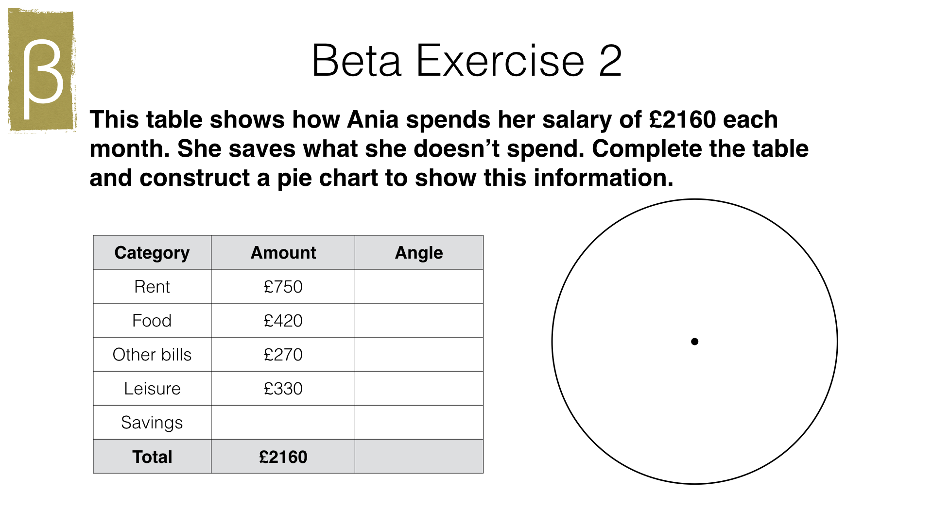
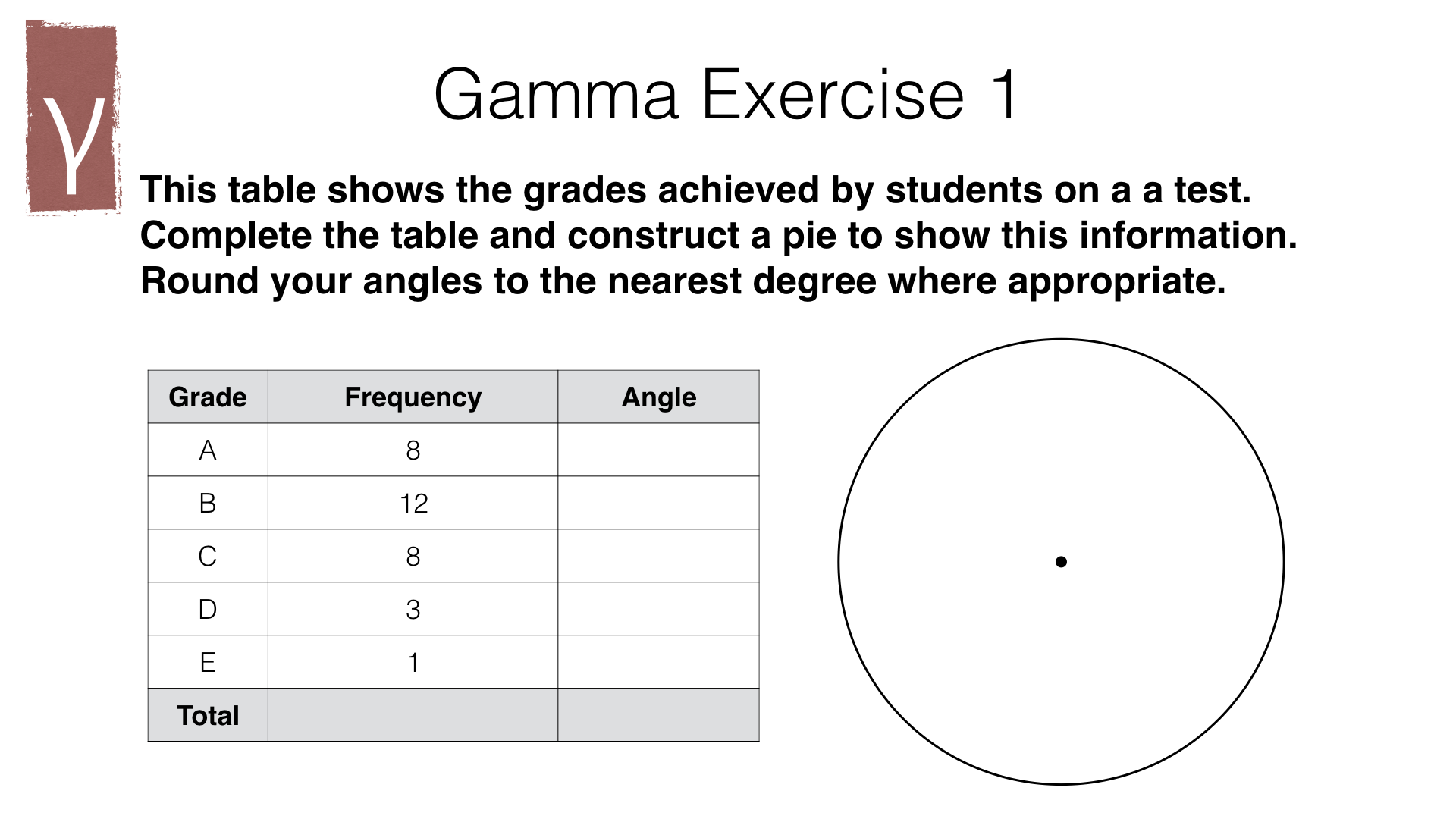
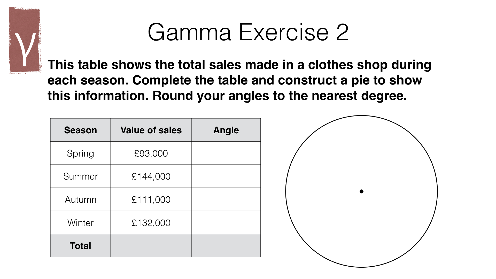
Part 2 – Constructing pie charts


Teacher resources for Part 2
Links to past exam questions
Teachers: log in to access these.
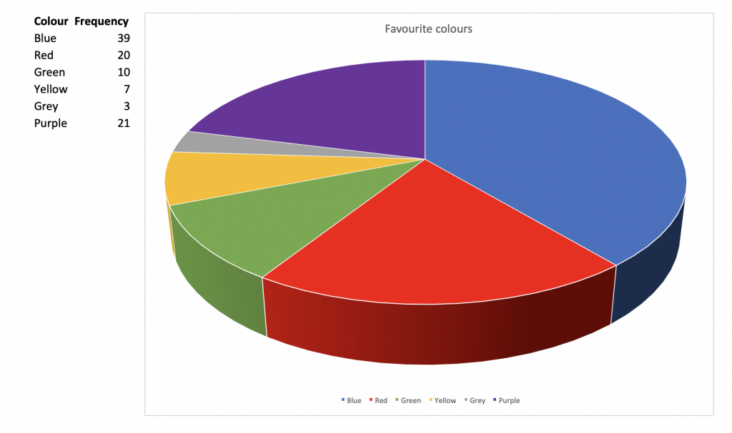
Why you shouldn’t use 3D pie charts
3D pie charts, like this one made in Microsoft Excel, might look more impressive than 2D pie charts, but you should avoid them. This is because they are evil distort the angles. For example, in this pie chart, more people chose purple than red as their favourite colour, but the section for red appears larger because it is “closer” to the foreground.
Cross-curricular link: waste management

At the point of final treatment, the total waste generated in the UK in 2016 weighed 214.3 million tonnes.
This figure is from the UK government.
- 104.0 million tones was recycled. , 69.1 million tonnes went into landfill and backfilling, and 13.0 million tonnes was incinerated. Construct a pie chart showing the following four categories of waste treatment: Recycled, Landfill/backfill, Incinerated, Other.
In the real world
Teachers: log in to view this content.